

... there must be some kind of catch, right?
The catch is that this TV absolutely fails to meet standards for core performance and user interface—heck, it isn't even nice to look at. Between a shoddily-built panel and a menu scheme that was outdated last year, this Westinghouse has almost nothing to offer except that it turns on when it's plugged in.
Picture Quality
"Abhorrent" sounds about right.
The Westinghouse DW50F1Y1 is an LED-backlit TV. You know how we know it's backlit and not edgelit? Because we can see the LED bulbs through the screen under numerous conditions. It's absolutely horrifying, and I'm not sure how this TV got out of the factory like this. There's also no backlight control, so it's anyone's guess if lowering the luminance would "hide" the LEDs better.
If you're still reading after a haymaker like that, better gird up your loins for what's next. The DW50F1Y1's default picture modes are absolutely riddled with errors.
Incorrect reference levels, the wrong colors, horrendous gamma correction, the highest amount of error within the grayscale that we've ever tested—I wish this were just exuberant hyperbole, but this TV is truly awful, and you don't need test equipment or an eye for calibration to see it. I watched various kinds of content, and the errors aren't subtle—the picture on this TV is consistently an eyesore.
The biggest offense is how this LCD aggressively oversharpens even old, analog-signal content, like a VCR or a Nintendo GameCube. Lines are thickened and made overly visible, which makes for a "pasted on" look. The TV's horrible black levels and unadjustable, dim peak luminance give content no space within which to breathe, instead making everything look flat. Combined with the aggressive sharpening, images look almost like stickers at times—pasted-on and devoid of lifelike contours.
Close your eyes and imagine your favorite movie... except this time, it's different. The colors are all wrong: Some of them are "too colorful," and some aren't colorful enough. The lines and borders around objects and people are overly exaggerated like a comic book, and the darkest level on-screen is an ashen gray, rather than black. When there's sunlight or bright lighting, it's still dim, like an old, yellowed lightbulb. What should be neutral grays are marred by varying levels of blue and red. Subtle luminance levels—those meant to be just barely perceptible—blend in with mid-bright elements.
Got the picture? Good. Now when I snap my fingers, don't buy this TV.
Design & Features
An antonym for frilly
The extremely affordable DW50F1Y1 is about as plain as modern TVs come. Apart from fairly slim bezels wrapping the screen's perimeter, nothing about this TV's design helps it stand out from any other TV from the last three or four years. This Westinghouse display will only have you swooning if you're upgrading from something like a Sony Trinitron.
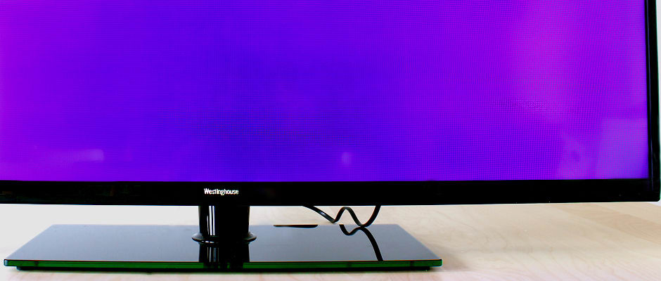
More interesting than anything on the panel is the DW50F1Y1's flat pedestal stand, which is overlaid in a subtly green glass. This makes for a heavy, sturdy footprint and a semi-handsome addition to an otherwise very boring display.
Seven control buttons line up vertically along the TV's right side; power, menu, input selection—this song's been sung before. On the left, you'll find inputs for composite (AV) and HDMI.
There are two additional HDMI, component video (no audio), RF in, and coaxial out ports on the back. Judging from port placement and availability, this 2013 TV seems geared more for the past than the future.
The DW50F1Y1's panel is packed alongside its stand and assembly screws, user manual, quick assembly guide, warranty card, two AAA batteries, and the remote control they belong to. Black plastic and medium-sized gray buttons are the whole story here, with finicky IR response and channel-specific functions.
{{ gallery "design" }}
Software & Interface
Very unrefined
While the average consumer may not think much of their television's menu, we lay awake at night thinking up ways they could be better. The software that's pre-installed on this Westinghouse is ugly, blocky, limiting, and sluggish. Ticking through menus using the included remote is about as effortless as trying to light a match in frozen mittens.
Like every other TV, the DW50F1Y1 features a few select sub-menus: Picture, Audio, Time, and Setup, regaled in white text against a gray-blue backdrop. Ugh. Each sub-menu is accompanied by a symbol that looks like top-tier 90s clipart. Double ugh.
Let me put it another way: We really don't like this software—despite the TV's established cheapness, it still detracts from both the aesthetic and functional experiences.
If your plan was to buy this cheap TV and use your expensive calibration equipment to get a top-notch picture out of it, think again. Outside of the basic controls like Contrast and Brightness, the only "advanced" picture option is a color temperature selector. There isn't even a control for the backlight. The nerve!
Anyway, if you don't care to achieve the best possible picture or sound, you probably won't be spending much time in the menu. If you do care, however, you've been warned.
{{ gallery "software" }}
The Finish Line
Worst of Year
It's not the end of the year yet, but it's close—2014 is just a month and a half away, so it's not a far cry to claim that this very well might be our worst TV of 2013.
The bottom line is that the DW50F1Y1 ($519.99) is in no way a good deal. Almost any other 50-inch TV on the market will serve you better; avoid this Westinghouse, and your eyes will thank you.
Behind the Screens
The Westinghouse DW50F1Y1 ($519.99) is very cheap for a 50-inch LCD—because it's lackluster in design and software, and fosters some of the worst picture quality we've ever seen. Skewed colors, tinted grays, improper gamma correction, the wrong reference levels—there's literally nothing that this TV does right, and no way to fix it.
Contrast Ratio
Bright black levels, dim white levels—what IS this, opposite day?
The hallmark of a fine television is the ability to produce black levels that are truly dark and white levels that are bright and flashy. The DW50F1Y1 does just the opposite: We tested a black level of 0.315 cd/m2 and a peak brightness of 129.60 cd/m2 , giving it a contrast ratio of 411:1. Even by the lowest standards, this is a terrible contrast ratio. Content on this TV will never look immersive or lifelike.
Viewing Angle
We'd say watch alone...
... but you should probably just not watch this TV at all. If you do, however, you'll be forced to sit front and center to avoid worsening the already shoddy picture quality. We tested a total viewing angle of 14°, or ±7° from center to either side, which is a truly stingy amount of viewing flexibility.
Grayscale Error
Over the top
A TV's grayscale is its spectrum of shades from pure black to peak white—there are 254 steps in-between, and they're created by a combination of the TV's red, green, and blue sub-pixels. Errors within the grayscale can result in blue- or red-tinting, sometimes even traces of yellow, which—needless to say—looks bad. Grayscale error is expressed in a sum called DeltaE, where 3 or less is considered acceptable. The DW50F1Y1 tested with a DeltaE of 11.64, which is just unspeakably bad.
RGB Balance
More like RGB IMbalance
Errors within the grayscale are created by improperly utilized sub-pixels. Ideally, each colored sub-pixel will create an equal amount of luminance within the grayscale, pro-rated by how well we see that color. The DW50F1Y1's RGB balance is rather atrocious: Blues appear far too prevalent within the signal, while reds/greens are neglected.
Color Gamut
Not the worst, but still way off
A color gamut is a visual illustration of the hue/saturation points of a TV's primary and secondary colors. Like all things of quality, TVs have set standards for just what hue their colors should be, and just how saturated those colors should be. While the Westinghouse didn't perform horribly here, it was a far cry from good: Red is undersatured, cyan is completely the wrong hue, white is tinged with blue, and green is oversaturated and the wrong hue. The end result is a very alien-looking picture.
Meet the tester

Lee was Reviewed's point person for most television and home theater products from 2012 until early 2022. Lee received Level II certification in TV calibration from the Imaging Science Foundation in 2013. As Editor of the Home Theater vertical, Lee oversaw reviews of TVs, monitors, soundbars, and Bluetooth speakers. He also reviewed headphones, and has a background in music performance.
Checking our work.
Our team is here for one purpose: to help you buy the best stuff and love what you own. Our writers, editors, and lab technicians obsess over the products we cover to make sure you're confident and satisfied. Have a different opinion about something we recommend? Email us and we'll compare notes.
Shoot us an email