These are the 6 colors you'll see everywhere in 2020
The greens, pinks, and blues are easy to use
 Credit:
Behr / Sherwin-Williams / Benjamin Moore
Products are chosen independently by our editors. Purchases made through our links may earn us a commission.
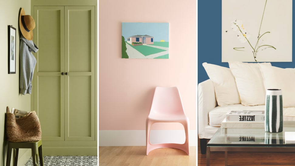
We’re months away from 2020 but we already know the colors we’ll be seeing in home décor, and they’re all nature-inspired. With few exceptions, popular paint companies have revealed deep blues and light greens for their colors of the year, and there’s a bit of pink out there for warmth and cheer.
Colors of the year don’t demand immediate change—if you’re happy with your current wall color, even if it’s plain vanilla, there’s no need to repaint. As an architectural color designer, I’ve often told my clients that your favorite color never goes out of style.
But if it’s time for you to paint a room or two and you find yourself standing in front of a display of color chips at the home center feeling confused, it can help to know what the latest color trends are.
Of course, you don’t have to apply trend colors to your walls. Décor items, bedding, cabinetry, and even household appliances can bring the colors into your home. When we all look back on 2020, these are the colors we’ll think of:
First Light by Benjamin Moore in living areas and bedrooms
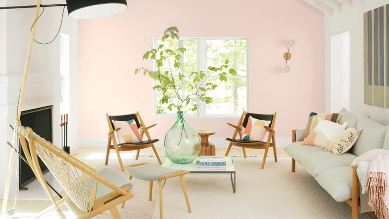
If you want a color that imparts a glow to the room, try First Light from Benjamin Moore. Pink is classic, refreshing, and optimistic.
Don’t believe that millennial pink is over. It has become a classic. Benjamin Moore picked the pale, blushy First Light as its color to represent the coming decade. The company’s director of color marketing and development, Andrea Magno, calls First Light “a new definition of the home—a shift in mindset from the material to satisfying the core needs in life.”
If you’re ready to move away from white walls and don’t know how to proceed, First Light is a refreshing, modern, optimistic choice. It’s a softer color, a balance between warm and cool that is easy to live with. Want a bedroom to glow? Paint a couple of coats of First Light on the ceiling. The color will surprise and delight you every morning when you open your eyes.
Pair with: Black or white wooden furniture, taupe and warm gray in surrounding rooms, and shiny brass accents everywhere
Get a 1-gallon can of Benjamin Moore Regal Select paint in First Light at Benjamin Moore for $58.99
Chinese Porcelain by PPG in bedrooms, living rooms, or hallways
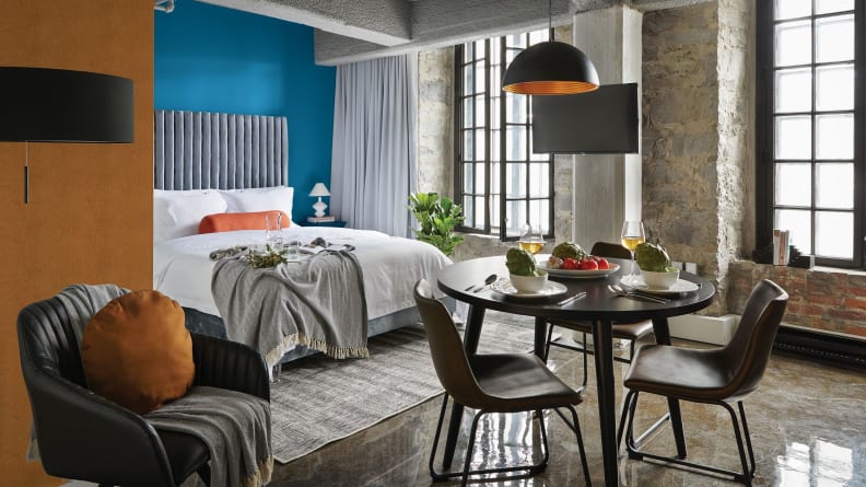
Chinese Porcelain, PPG's cobalt blue Color of the Year is a rich jewel-tone. A few warm accents create a gorgeous contrast.
Chinese Porcelain, a rich cobalt, has a calming vibe. It’s an extension of the saturated jewel-tone trend that is returning to home décor and fashion. PPG’s senior color marketing manager Dee Schlotter told us, “Blue is reassuring and comfortable in the right room.” If you choose this deep, dreamy blue for your walls, frame it with white trim and make sure that your room has plenty of natural light to show it off.
Pair with: Neutrals, oranges, browns, and gold metallic accents
Get a 1-gallon can of PPG paint in Chinese Porcelain at Home Depot for $33.98
Naval by Sherwin-Williams in kitchens, dining areas, and bedrooms
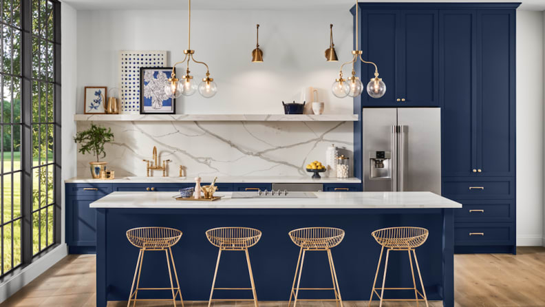
A modern kitchen looks fresh with Sherwin-Williams Naval on the cabinets. Sumptuous finishes like white marble and warm metals complement this navy blue shade.
Navy blue is crisp and classic. When you use Naval on kitchen cabinetry, it looks bold and confident. White shelves or upper cabinets with dark lower cabinets are an offshoot of the tuxedo kitchen trend. Used on the walls of the dining room, Naval can make you feel like every meal is taking place in the night sky.
Sue Wadden, director of color marketing for Sherwin-Williams, calls Naval “elegant, glamorous, and dramatic.” It’s also part of the wellness trend. Wadden believes that in the coming decade, “We’ll see how color can influence our minds, bodies, and spirits.” Since blue is all about serenity, use Naval on an accent wall in any room and take a deep, cleansing breath.
Pair with: Pale furniture, green plants, and luxe finishes like gleaming gold, copper, and marble
Get a sample can of Sherwin-Williams paint in Naval at Lowe's for $3.98
Back to Nature by Behr in the living room, mudroom, or office

Behr Back to Nature is a garden green that is easy to live with, making a home office feel calm.
A soft meadow green, Back to Nature is refreshing and restorative. It mingles well with the grays and whites you may already have in your home. Green is easy on the eyes and represents growth and energy.
Behr’s vice president of color and creative services Erica Woelfel told us, “As we look ahead to a new decade, Back to Nature encourages us to re-engage with the natural world, which we know can have a real, positive impact on our well-being.”
Pair with: Black, white, and wood-finished furniture, and living plants Get a 1-gallon can of Behr Back to Nature at Home Depot for $43.98
Minty Fresh by Dunn-Edwards on the front door or bedroom wall
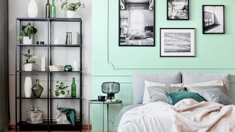
The tranquil Minty Fresh is Dunn-Edwards' 2020 Color of the Year. It plays well with almost any other color in the room.
A bright pastel blue-green reminiscent of cool water, Minty Fresh reflects the teal greens that are perpetually in style. According to Sara McLean, color expert and stylist for Dunn-Edwards, this color speaks to the past and the future. “We are searching for tranquility and finding the balance between calm and progress,” she says.
Paint Minty Fresh on the front door of a gray house for a refreshing change, or put it on the bedroom walls to give the space a sense of calm. Natural and grounded, this color plays nicely with almost any other color.
Pair with: Reclaimed wood, light pink, pale gray, white trim
Get a color sample of Dunn-Edwards paint in Minty Fresh at Dunn-Edwards for free
Whirlwind by Glidden in any room in the house
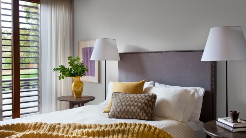
Ideal for the DIY homeowner, Whirlwind by Glidden works in every room. Paint your walls this warm gray, accent with brights, and add black trim to frame the view.
Glidden has decided to get out of the color trends game in favor of choosing a color that DIYers will actually use. The company is promoting Whirlwind, a soft, warm gray with a touch of lavender in the undertone. Paint your room this shade of gray so you can get onto the fun stuff: adding furnishings and accessories.
Since gray integrates well with both modern and traditional styles, it can go almost anywhere. Glidden’s color guru Kim Perry says, “It’s perfect for any room, a super-usable color.” Perry recommends using Whirlpool for the wall and black for the trim. “It’s on the Farmhouse trend,” she says. “Black trim makes the room stand out.”
Pair with: Décor pieces in bright accent colors like green and violet
Get a 1-gallon can of Glidden paint in Whirlwind at Home Depot for $20.98
Test before you paint
We can’t tell you which colors will work best for your home because we haven’t seen it. But if we had just one bit of advice for you, it would be to always test a color before you paint. Get a sample container of your chosen shade, paint a few coats on a big poster board, and hang it on the wall with blue painter’s tape. You might be amazed at how much different a color can look once you see it in the room.


